Case Study
Boosting business value through web re-design
Discovering the usability issues in the current website, understanding the problem behind high bounce rates and create a new solution for this problem with a website redesign.
Year
Jan 2022
My role
UX/UI Designer. I planned and conducted usability research, testing, product concept and design from problem discovery to QA. I organised workshops and dialogue with stakeholders to help stay aligned on design. I also worked closely with a design lead to align the look and feel with the new branding.
Mischief Makers is a facilitation agency with lots of focus on bringing energy and enjoyment to working, meetings and learning. They also offer trainings in facilitation for individuals and businesses.
The brief
"Reduce bounce rates and increase user conversions by discovering usability issues with current website. Improve overall UX and apply new branding to the website"
Mischief Makers website was experiencing high bounce rates. It appears that most visitors get lost pretty quickly and can’t seem to find the information they are looking for to make decisions on the website, especially with users attemting to find info about their flagship course and register for it.
This often leads to users leaving the website without fulfilling their purpose of visit. The course detail page is one of the focus of the project because that's where most of the conversions are expected to happen.
The course pages are text heavy, not intuitive and stressful to find important information.
Avg Bounce rate
66.45%
Avg session duration
1.34min
New sessions/user
1.6
My design process
It appears that most visitors get lost pretty quickly and can’t seem to find the information they are looking for to make decisions on the website, especially with users attemting to find info about their flagship course and register for it. The numbers to improve are:
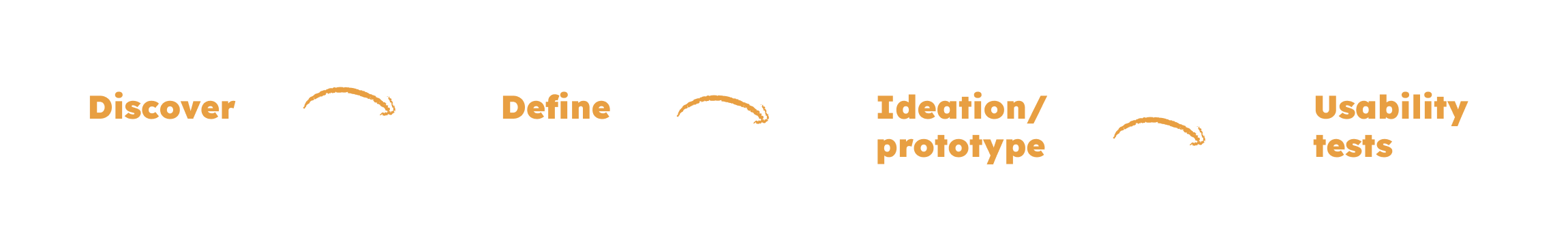
Discovery
Competitive analysis
I did some research to understand what was wrong with the current website. To wrap my head around facilitation as a business and how other facilitation agencies have presented their services, I looked into companies such as Abracademy and Limelights.

Expert review
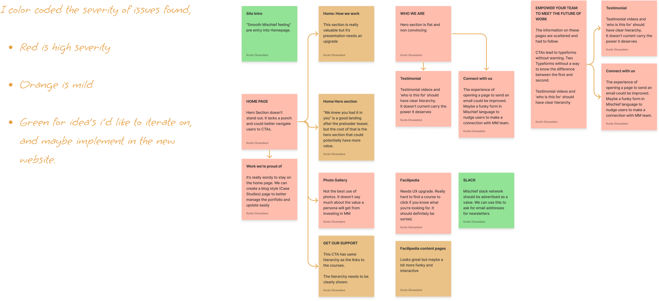
I analysed the current situation of the website and what can be potentially improved based on b web design practices.
User Interviews
To understand what the potential users needs to understand about the facilitation courses, the important information they seek to help them decide if a course is for them or not, I interviewed 5 people that fits the persona that had been created by Mischief Makers.
User journey
With all the data gathered, I mapped the user journey to help me visualise what was really wrong and also to get stake holders to understand the research I’ve done. This made it easy to define the problems that needed to be solved, and shaped the direction my design would take.

Define
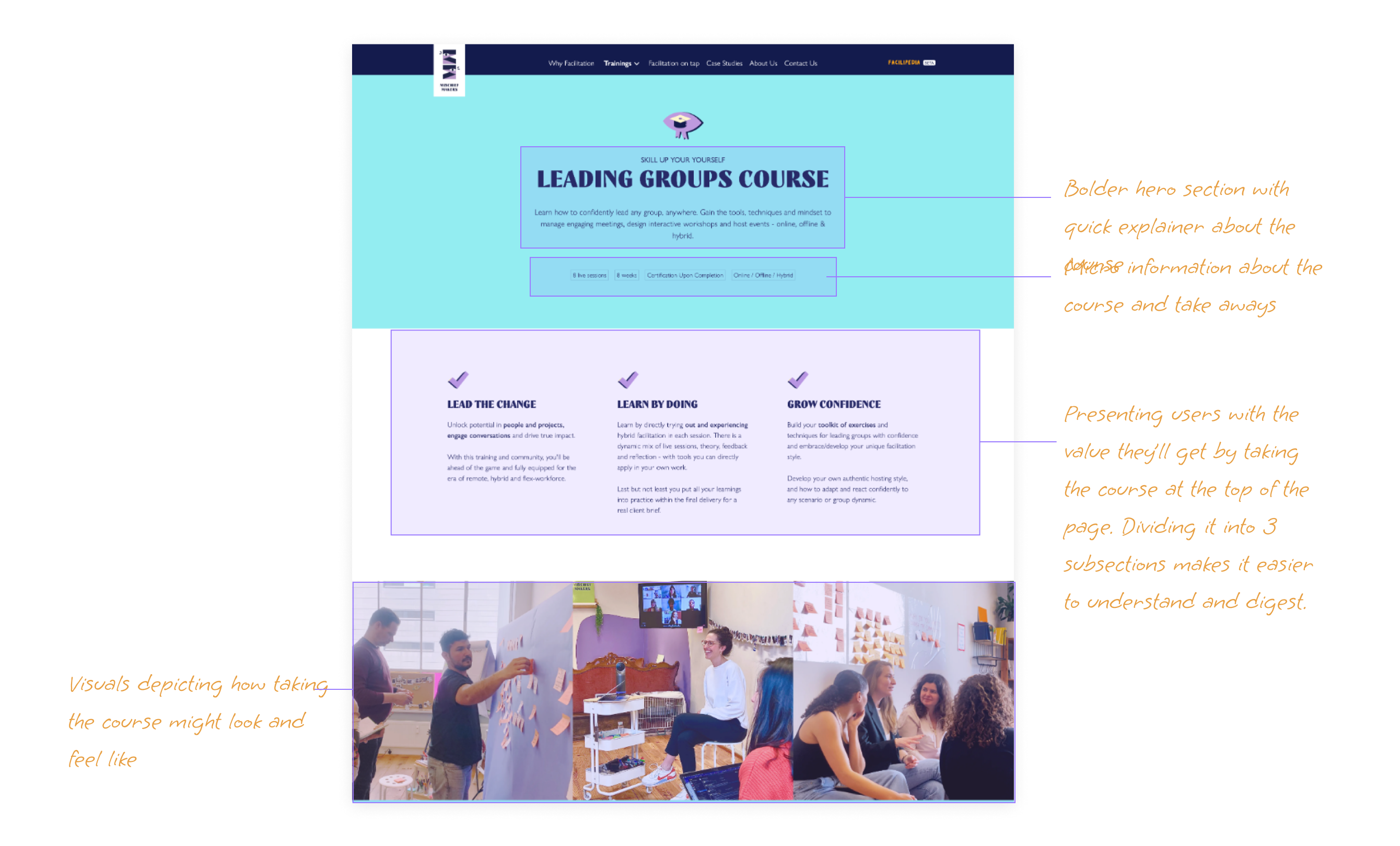
The research shows that users can’t find the information they need to sign up for the course. After measuring potential effort and impact, I chose to focus on these 3 problems to solve.
1. Information hierarchy
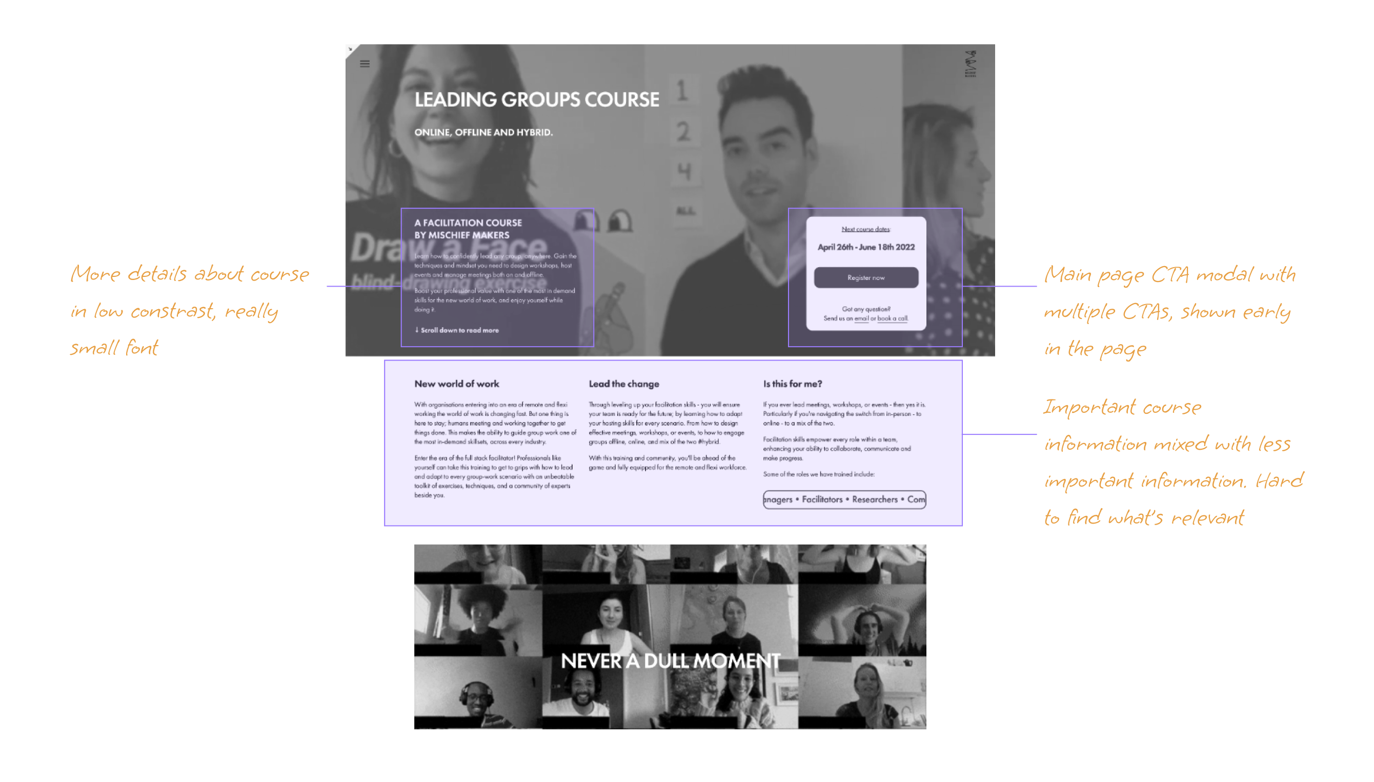
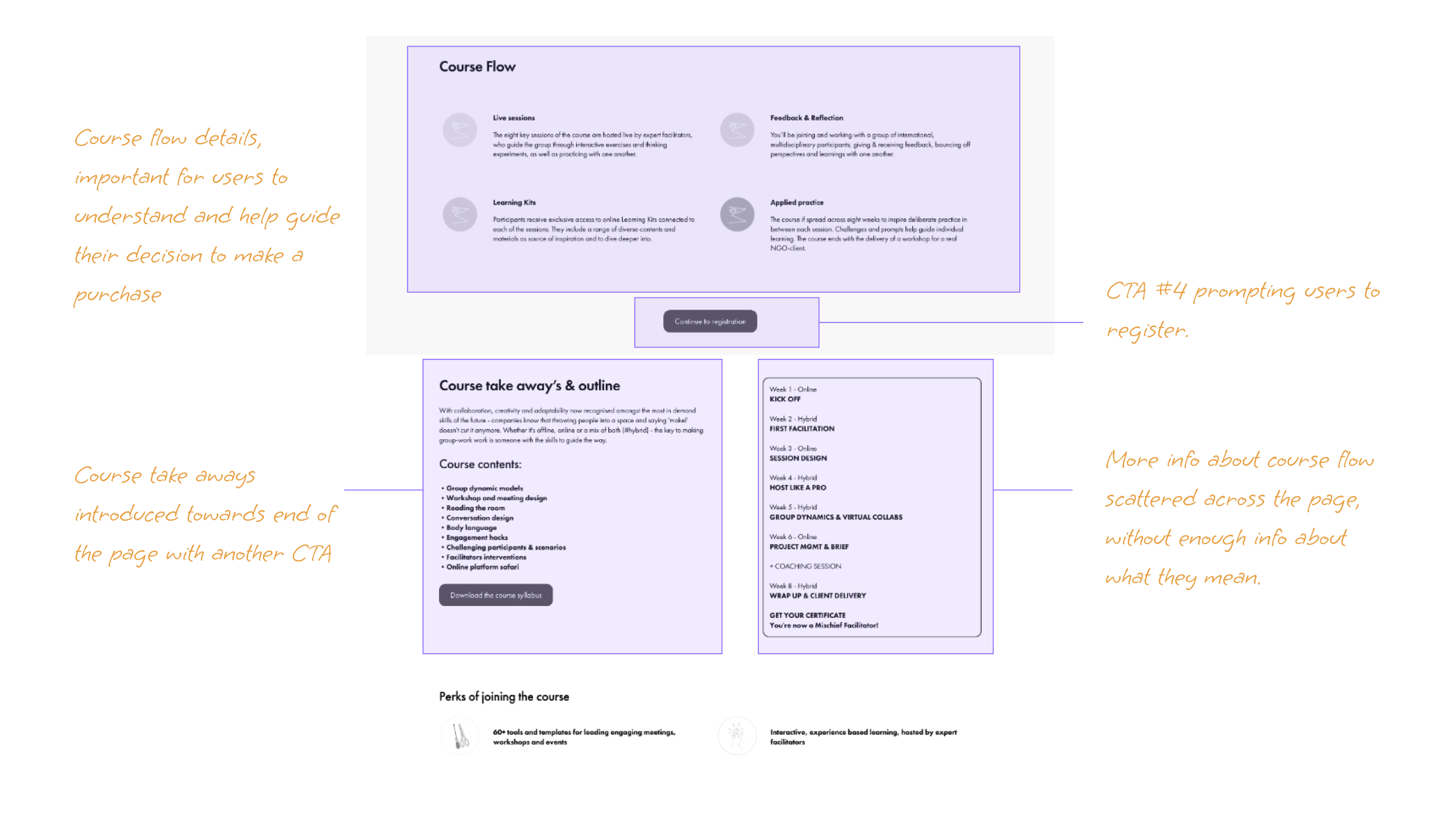
Visitors want to find the right information they need on time, without guessing what they’re looking at. Users are bouncing because finding information is not user friendly and tedious.
2. Consistency & standards
Current website has usability issues that violates usability heuristics - Consistency & standards and multiple UX laws, including hicks law. There are often too many CTAs in view at same time, which leads to confusion.
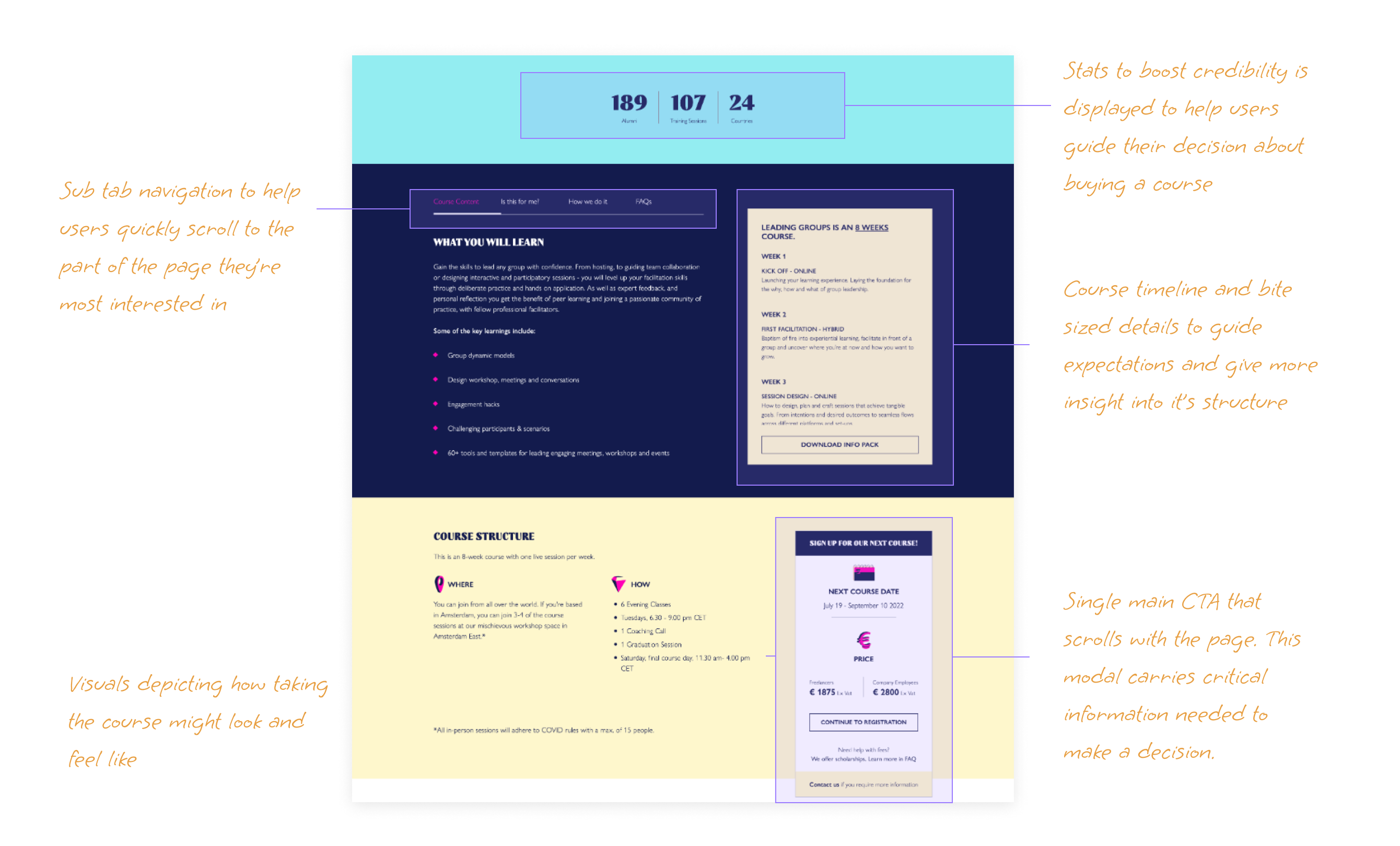
3. Trust and credibility
Users need to see testimonial and case studies to feel secured in making purchases. Adding an FAQ section to training pages will make it easier for visitors to find answers they need in order to sign up for a course.
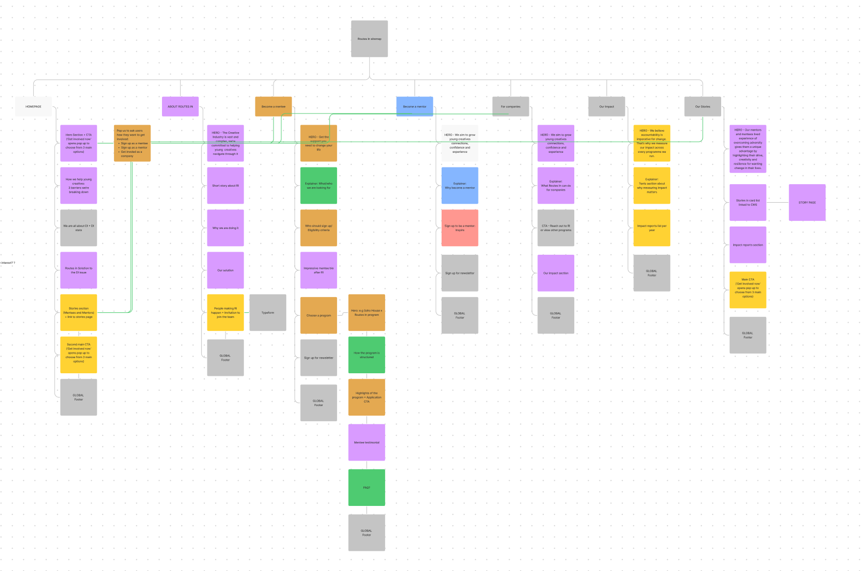
Ideation and Prototype
Userflow and site map
I began by mapping out a user flow for the ‘course details page’ to highlight important user touchpoints. I rough sketched several flows user might take to reach their goals. I also created a site map from this flow, then color coded each sections based on answers most users want answered. The colors made it easy to see where different kind of information is located across the site and how to navigate there. Also made it easy to explain my progress to stakeholders.
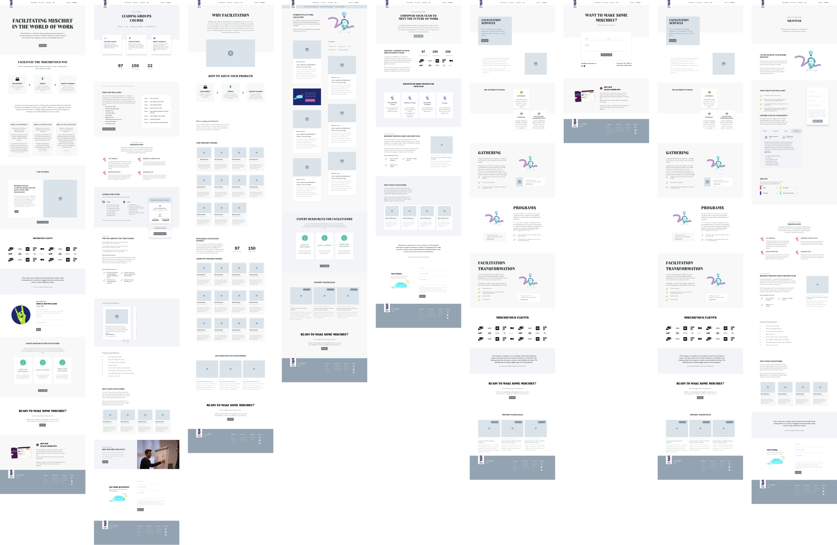
Wireframes
These wireframes are the end results of several rounds of sketching and reiterating on the sketches to get the best possible Information Architecture for the website.
Usability tests
The tests were carried out in small tasks. I invited a combination of new users and existing users to gather insights. Apart from the metrics shown below, I paid attention to the hotspots, the misclicks and hints for information architecture issues and potential cause for bounce rates.

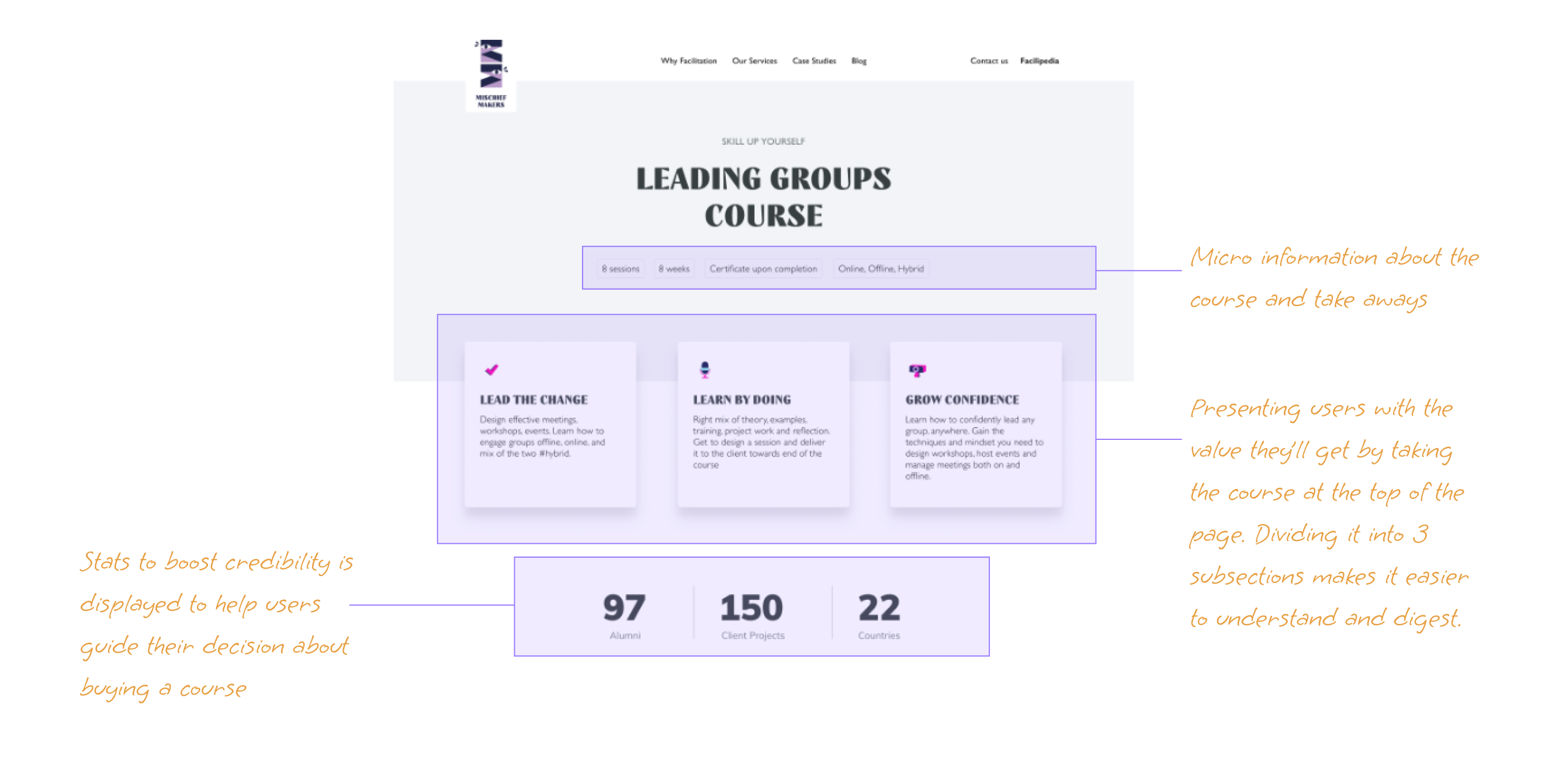
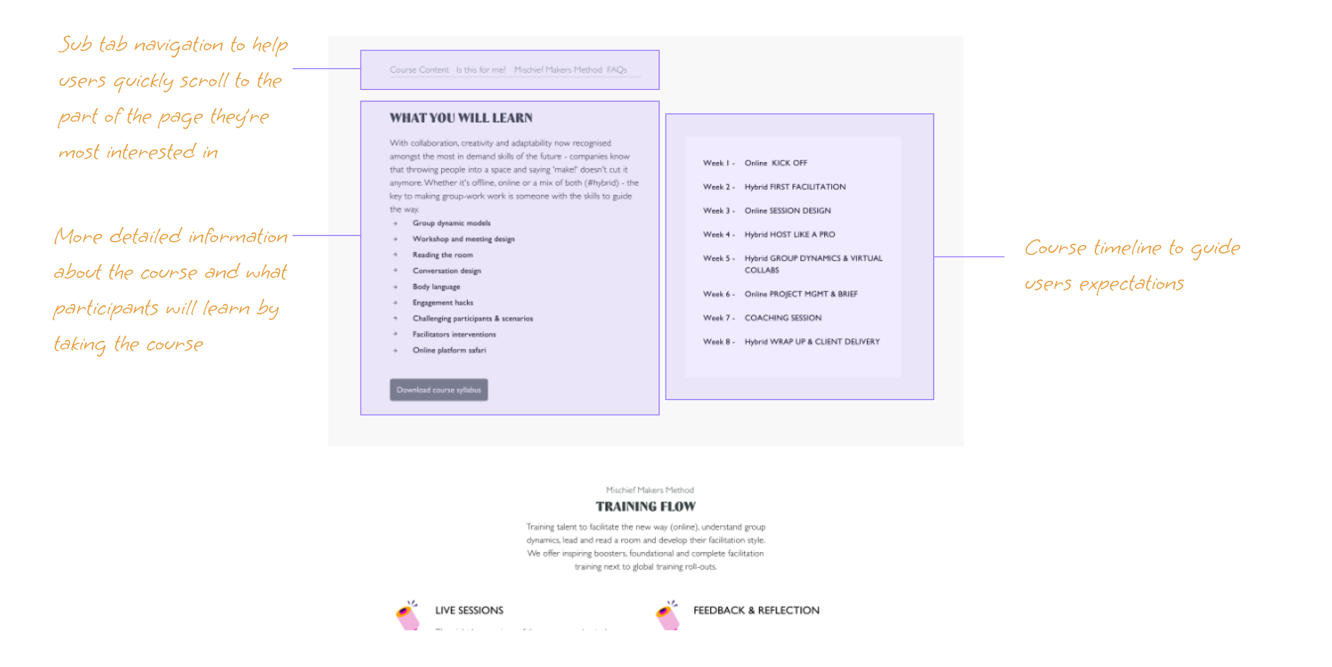
The solution
#1. Information hierarchy
I restructured the pages to display information according to relevance and importance. The page structure guides users to where they need to be, including new navigation designed to help users find what they're looking for quicker.
#2. Reduced amount of CTAs
Instead of having multiple CTAs placed across the page, I designed a modal that scrolls with the page. This modal has all the important information needed for users to sign up for a course. Users can navigate to anywhere on the website within reach of the modal.
#3. Homepage hero section
Hero section is the best opportunity to engage users. The current content on the homepage is aligned with the brand, the hero section can be used to communicate the company’s “what?”, faster.
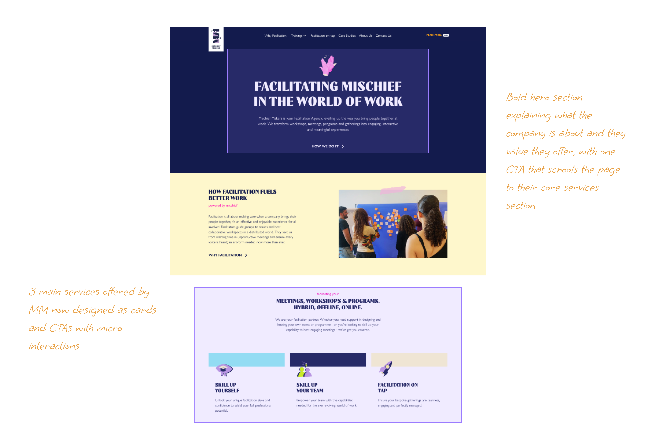
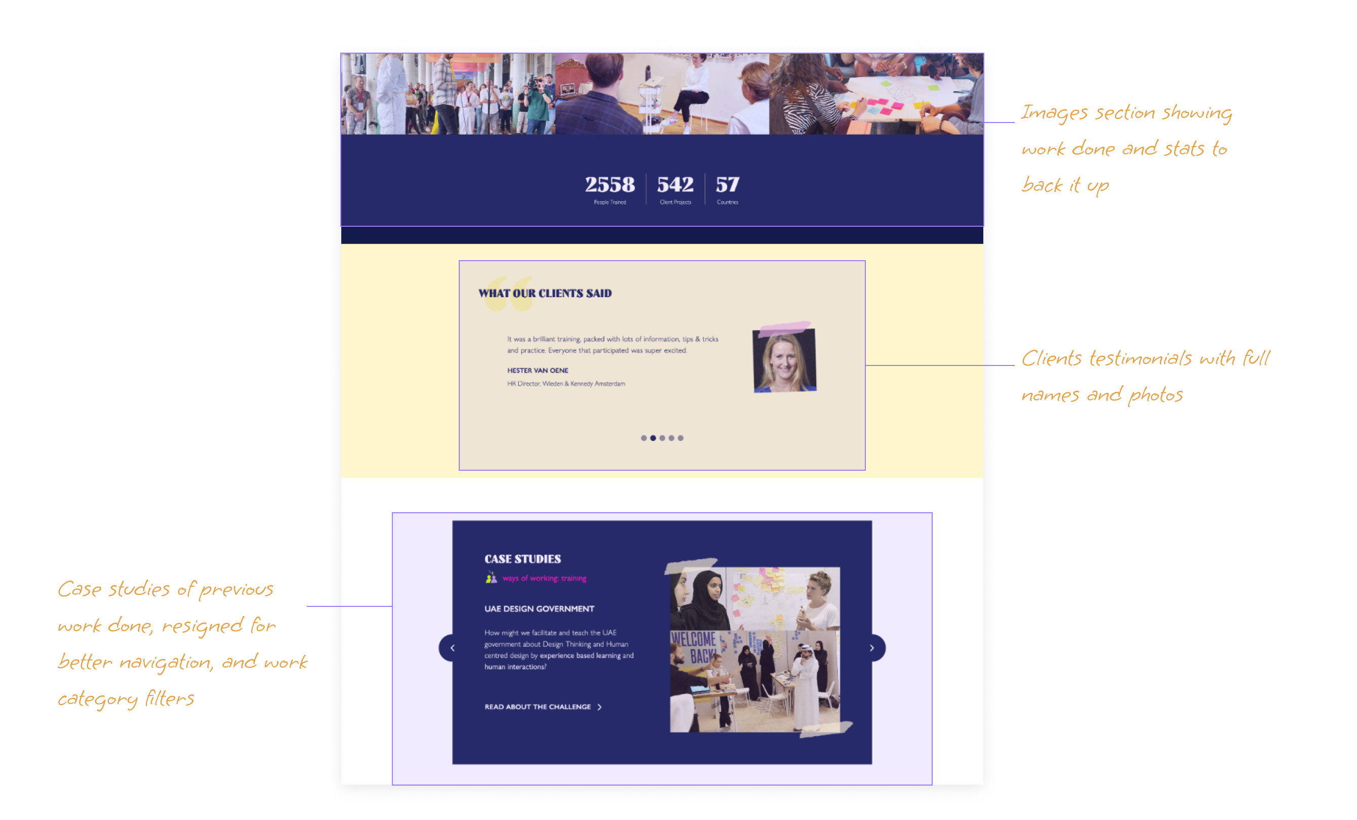
#4. Boosting trust and credibility
To gain trust and credibility, I redesigned the case study section to feature several case studies with a navigation feature and filter options that helps users quickly find which case study they find most interesting.
Post launch results
Comparing Google Analytics 4 months data of Oct 2021 - Jan 2022 before the launch with data from Feb -May 2022, the results shows that the new design is effective in reaching the user and business goals.
Avg Bounce rate
-22.7%
66.46% to 51.3%
Avg session duration
+79%
1.34mins to 2.49mins
New sessions/user
+10.6%
1.6 to 1.78
✌🏾
Want something like this?
Let's transform your site into one customer magnets together. I help companies with the strategy and structure of their website. With a high-end design and development.

